This is part one of a two part series on habits of highly effective photographers. Read part two of this series.
Writer’s tend to be poets at heart. They feel deeply, and use words to circle a thought, then creep up on it, and, sometimes actually capture it. The best writers speak for all of us, and say what we feel and think, but in powerful, memorable ways. Taking a photograph is to seize the mood, an idea, a feeling, an issue–all of which is involved in producing a winning feature, but as a visual representation. For the freelance writer and journalist, producing a quality image may mean doubling your paycheck. When done well, the photograph tells a story. It’s a visual narrative that uses facial expressions, light, actions and more to provoke a mood, a feeling that moves an audience to identify, to question, to pause, to feel at peace.
These days publications and online services are as concerned with the art elements as they are the article, and you may be able to double your money by submitting a photograph that assists you in telling the story. Editors need graphic art, line art, info graphics, tables of statistics, maps, and, most of all, art–pictures, either black-and-white photographs, colored slides or prints, or digital images that can accompany the words of your article.
Let’s explore a step-by-step approach on taking good quality photographs. By applying the these timeless principles, you will be equipped to see the photograph that is required for the article, and bring it to market. These ideas will work no matter what type of equipment you have.
Whatever format you use, the goal is to tell a gripping story with words and pictures to move your audience, to help them see the wonder of life in all its tragedy, wonder and joy.
Furthermore, let’s explore technical issues in passing only. The primary goal is to consider composition principles to improve the art you submit with your article.
Habit 1: Move in
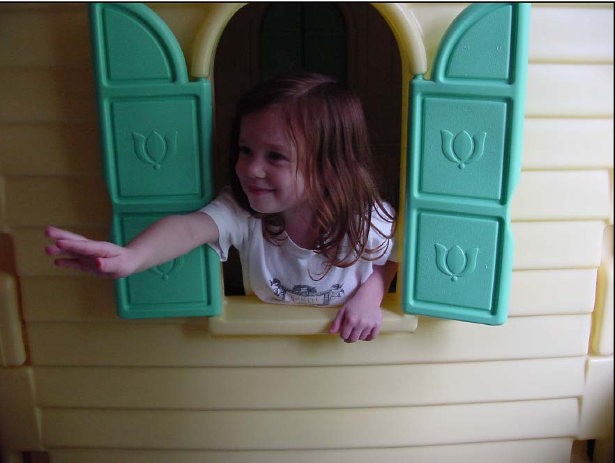
Solid-colored backgrounds work well.
The theme is composition, the way the parts of the picture are arranged. For most photographers, getting close to your subject can enhance composition, your first step in becoming a highly effective photographer. For our purposes, most of your photographs will be of people, and your editor will want to see the person’s face–not her back, but her face. Think head and shoulders for a photograph of a single subject. Consider the photograph of three-year-old
Alanna from the playhouse. To remember the idea of the perennial need for headshots, think about Alanna popping out of the playhouse window. That idea alone will allow you to remember that most publications want a clear shot of the person’s head. While it may be ordinary, it is a desirable picture that a publication can use. For now, concentrate on taking the photograph about four to five feet from your subject. That task alone will keep you busy. Call it the triple F rule, the four to-five-feet rule.
Black Star picture agency began in the 1930s taking photographs of the world’s hot spots. A 1997 review of their work from more than six decades in Hendrik Neubauer’s Black Star, 60 years of photojournalism (Koln: Konemann), shows hundreds of graphic still photographs–and all are of people engaged in dramatic moments. Audiences want to see the person’s face. A close-up of a hand or jewelry can work, but most publications want to see your subject’s face.
You will become a highly effective photographer with the practice of photographing a solid close-up shot of the person’s face. As you gain confidence, ask your subject to avoid posing, and let him or her talk or show some kind of facial reaction. Let the subject react to your question and wait, pause just a beat or two, and allow the subject to laugh, look puzzled, express sadness and so on.
Most of all, however, get the person’s face, either as a three-quarter profile, or by allowing the person to face the camera head on. Take a photograph of the person looking at the camera; next take a photograph of the person facing forward, but not looking at the camera. Depending on the goal of the article, the eyes-forward or eyes-away look will take the day. In most cases, the portrait approach of the subject caught in a casual moment is the pose your audience will appreciate most.
When using digital or disposable cameras, be aware of getting too close. Four feet is about as close as a photographer can get with those cameras. In summary, practice the Triple F rule for the shot that is most likely to be used with your article.
Habit 2: Monitor the background and the foreground
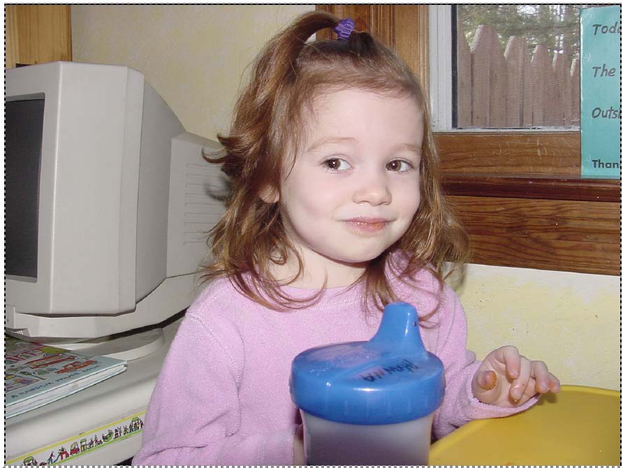
Beware of busy backgrounds and foregrounds.
Highly effective photographers look at all the parts of the photographs and see life through a rectangle, a frame. Better photographers see the clutter in a photograph, particularly the background, and next, the foreground. You now know to get close to your subject; next, monitor the background behind the subject’s head. Beware of the painting on the wall, the stray light from another light source or the busy traffic of the nearby street. The best background is a blank wall or a solid color background.
I photographed Alanna in a playroom, full of bright blues, vivid reds and sunny yellows, but nearly every angle, while colorful, contained a distraction in the background. I moved around to center the camera on her face, but the background contained a bulletin board, a shelf, or some other objects that interfered with the subject, what we call the focal point of the photograph.
Look at this shot of Alanna, taken the same day as the photograph of her in the playhouse. While the shot is a close up and features her childish delight, the background intrudes. Notice the computer monitor and window in the background and the sip cup in the foreground? Do you see how distracting these objects can be if the subject is the focal point? Yes, it’s true that the objects provide some sense of Alanna’s environment, but a better picture is available for the photographer who is willing to wait for the right shot.
Another issue associated with backgrounds and foregrounds is the idea of framing. In the first photograph, the window of the playhouse frames the subject. Windows and doorways can be used to frame your subject, meaning the shape of the opening works like a picture frame to draw the viewer’s eye to the focal point. Look for these natural frames as you take your photograph. A limb on a tree works to frame the top of your photograph when you are working outside.
Tip: When shooting outdoors, try to keep your subject in the shade and use the flash to provide what is known as spot flash to flatter your subject. Avoid taking shots when the sun is at its zenith to avoid harsh shadows. For the best light, consider shooting a color photograph at sunrise or sunset when the amber rays of the sun cast the warmest light. Be advised, however, this light fades within a few minutes.
Getting close to your subject may not be difficult, but finding an uncluttered background may take some work. Get in the habit of moving around to eliminate distractions. Try getting higher than the subject’s head by standing on a sturdy piece of furniture and looking down on the subject. By contrast, try kneeling and looking up toward your subject. Select the angle that works best. As a last resort, have your subject move. With some creativity, however, the photographer can get close and avoid a busy background by adjusting the angle, the direction of the camera shot.
Keep in mind that the camera vision is different from your vision. The human eye can zero in on an object and ignore the objects that are unimportant. A camera sees all the objects the same, forcing the photographer to visually point your audience in the right direction. The most obvious way to direct your audience’s attention to the subject matter is by reducing the number of elements in the photograph, thereby making the subject matter clear to us.
Once you begin getting close to the subject and looking at the background, you can begin to experiment with more dramatic approaches. At first, concentrate on the triple B rule, Background, Background, Background. Using the Triple F and the Triple B will give you the FB, foolproof beauty.
Habit 3: Look at shapes and lines

Rectangles and lines can lead the eye to a focal point.
The doorway works as a picture frame in a photograph, but it also can be thought of as a shape, a rectangle. It is one of the many shapes found in man-made environments, or in nature. A student’s desk may be square; a book, a rectangle; a clock, a circle; and a lampshade, a triangle. Natural and man-made objects can be reduced to shapes and boards, bricks and shadows can be thought of as lines. As you compose your photograph, consider the shapes and lines to arrange them in a pattern. Remember, as a photographer, you must move around to compose the picture inside the frame. Look for lines that lead the viewer’s eye to your subject. Leading lines are one of the best composition principles of good photographers.
In this photograph of Shaun, shapes are evident. The fence to his back forms a large rectangle. The box on which he sits is similar to a square. Now look a little more closely. Imagine that the fence and box are connected. Together the shapes make a kind of backward “L.” Shaun’s posture also makes a kind of “L” with his back as the longer part of the L and his legs as the shorter part of the L.
In this photograph, the lines move in an up-and-down motion in the fence and in back-and-forth motion of the box. In the background are saplings that form a kind of up-and-down pattern with the stray fence post to the left working as a kind of frame. The branch above his head helps frame the shot. Together, the fence post and tree limb create another crude L shape that goes in the opposite direction as the fence and box. The lines on Shaun’s pants and coat break up the static, straight lines and give the picture some rhythm. In short, the photograph contains a series of shapes and lines. As you take a photograph, become aware of these shapes and use them to arrange your subject in a pleasing pose. Shape your writing success by lining up good quality photographs to submit with your copy.
Habit 4: Look for Z pattern, or the S pattern

A Z-shaped pattern can lead the eye to the focal point.
Among the most pleasing patterns to the human eye is the shape of an “S,” and the shape of a “Z.” In each case, the line curves from either left to right or right to left. In the rectangle represented by the frame in a camera, the S or Z is a way to allow the eye to move from top to bottom in the frame. The mind sees the line and intuitively traces it throughout the photograph.
In this photograph, the fence shape suggests a kind of rudimentary Z, with the top leg of the Z connecting to the gray-colored fence in the background. The bottom part of the fence cuts across the frame in the foreground to suggest the bottom leg of the Z. At the most severe angle of the Z is Shaun who helps suggest motion by leaning into the area that the most severe angle of the Z is pointing. The fence helps point the viewer’s eye to Shaun, the focal point of the picture. The lines from the sidewalks tend to converge where Shaun is standing, and those lines help the viewer see that Shaun is the subject.
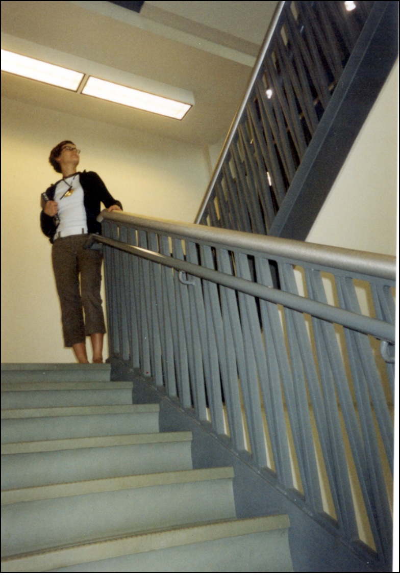
Carlyn Bekken, Ormond Beach, Fla., poses in the stairwell at
Bryan College, Dayton, Tenn. Matthew Berman, Ruckersville,
Va., took this picture at part of a seminar on photography and
mass media. Used with permission.
The preceding photograph relies on the steps and the railing in the stairwell to suggest the Z pattern. Winding country roads work as S patterns. Mountain ranges work as Z patterns. A series of clouds can create an S or Z pattern, even the gangway on a ferryboat can make the pattern. The playground equipment may imitate an S or Z. A rope, a walkway or a driveway can do the same. Fabric, jewelry and other objects also may be arranged in an S or Z pattern. Force yourself to look for these patterns and you will create a photograph that others will enjoy and be drawn to your words.
This is an excerpt from Dr. Michael Ray Smith’s book FeatureWriting.net. Used with permission.
Download the entire book for free from our MTI Online resource center.
Photo by Nick Elliott on Unsplash
Related posts
Magazine Training International’s mission is to encourage, strengthen, and provide training and resources to Christian magazine publishers as they seek to build the church and reach their societies for Christ.

