Read part one of this series on habits of highly effective photographers.
Let’s explore a step-by-step approach on taking good quality photographs. By applying the these timeless principles, you will be equipped to see the photograph that is required for the article, and bring it to market. These ideas will work no matter what type of equipment you have.
Whatever format you use, the goal is to tell a gripping story with words and pictures to move your audience, to help them see the wonder of life in all its tragedy, wonder and joy.
Furthermore, let’s explore technical issues in passing only. The primary goal is to consider composition principles to improve the art you submit with your article.
Habit 5: Look for contrasts–winner-loser, big-small, light-dark.
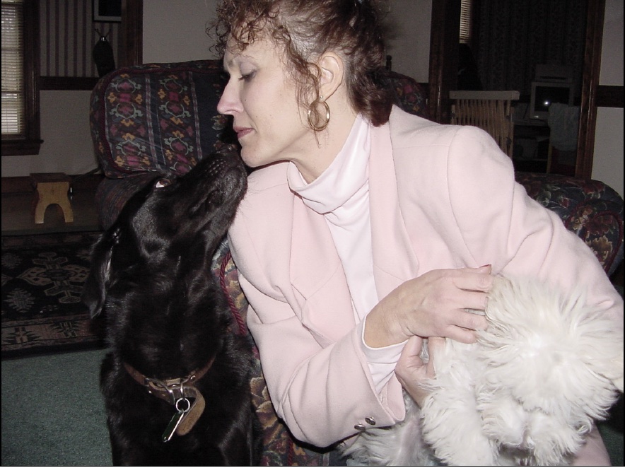
A dark dog and a light dog add contrast to a photograph.
Contrasts often help tell a story. Imagine a photograph of an athlete who is jubilant in victory with her hands stretched over her head, but beside her is her defeated opponent, shoulders slumped, holding back the tears. That’s a contrast.
In the next photograph, we have Barbara and two dogs, a Labrador retriever and a bichon frise. The lab is an adult and jet black; the bichon is a puppy and snowy white. The puppy is pulling away from Barbara and her color nearly blends into the soft, light-colored fabric of Barbara’s outfit.
The muzzle of the Labrador is pointed at Barbara’s chin, a similarity, while the puppy is moving away from the action, a contrast.
A dark dog and a light dog add contrast to a photograph.
Overall, the photograph doesn’t have the balance that a well-composed shot should possess and the white dog is nearly lost on the pink jacket; nonetheless, it provides some contrasts that make a still photograph appear to have motion. The background, for instance, is busy and this distracts from the action. Consider contrasts as you select your subject matter.
Habit 6: Use the rule of thirds
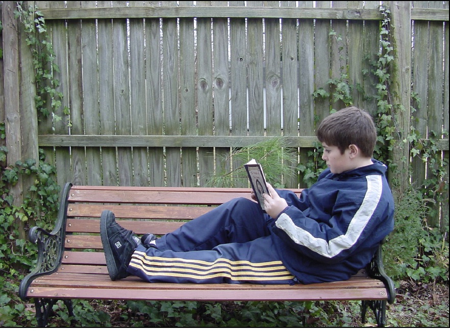
The subject is in the corner of the frame, not the center.
The viewing area in the viewing frame of a camera can be reduced to a kind of tic-tac-toe board with lines dividing the area of the frame into three equal parts, both horizontally and vertically.
Can you see it?
According to the rule of thirds, the subject of the photograph works best by placing him or her where the lines intersect. The rule says that a major element placed at one of their junctions will create the more dynamic picture. Usually, you will have to impose the imaginary lines on the viewing area and move yourself around to put your subject either to the top left, bottom left, top right or bottom right. However, sometimes the lines occur in nature and you can use them to guide your composition. For instance, horizons could be on one of the horizontal lines just above or below the center of the frame.
In the photograph of Shaun sitting on the bench, the idea of the tic-tac-toe board is suggested, but, in this case, the thirds resemble quadrants. His head and trunk are in the bottom, right quadrant. The principle would work better had the photographer moved back a few more feet. However, the focal point is concentrated in one corner and that’s the idea you want to consider. Practice putting the subject of the shot in one of the corners to create a pleasing composition. Avoid placing the subject in the center of the frame. In photography, the sweet spot tends to be off-center, not the bull’s eye.
Do you see the leading lines in the photograph? Notice the lines of the fence that move vertically across the background. The slats of the bench move horizontally. They intersect where Shaun is sitting. Those leads intuitively tell the viewer that Shaun is the focal point.
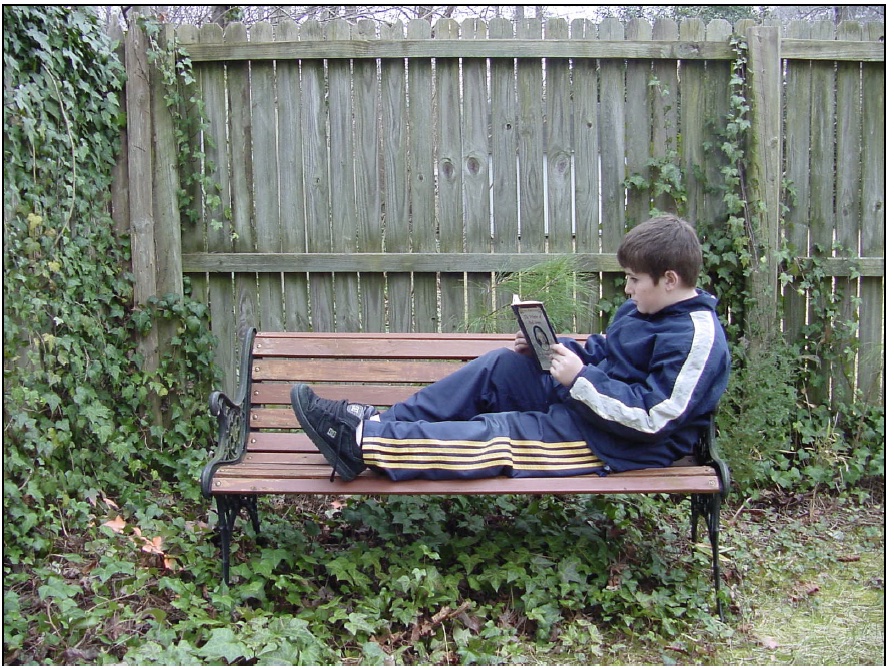
Lines intersect to point the eye to the focal point.
This photograph shows more of the foreground and background and suggests a slightly different mood. The ivy seems to be climbing toward the intersection of the bench, the grass, the fence, and, most importantly, the focal point, Shaun. As you take a photograph, pause, take a deep breath and look for the photograph that can be. Place the subject where the imaginary lines of the thirds intersect and your art will begin to have a professional feel about it and your editor will remember you fondly.
Habit 7: Look for repeated patterns
Anyone who decorates knows the benefit of repeating a pattern in the rug, sofa and other areas in a living area. The use of a similar colored wood or a stand of various sizes of candles creates a cozy feel to a room. As you dress, you think colors and fabrics. Corduroy goes well with cotton, but may appear odd next to a satin sports coat. Khakis and leather may match, but black trousers with a dark navy, nearly black turtleneck may not look good together.
The best composition uses repeated patterns for a well-balanced feel. The patterns can be dramatic such as a checkered pattern on a floor, on a pillow and in your subject’s shirt; however, the better patterns are subtler and have the power of a whisper over a shout.
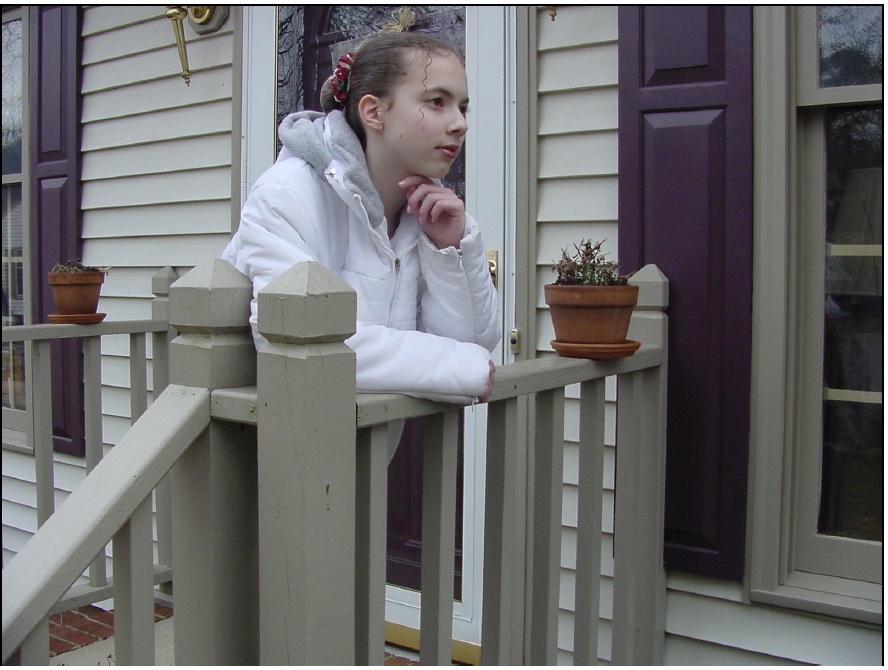
The subject’s left arm makes an angle like the railing.
At first glance, the picture of Taylor may not reveal repetition until you see the picture as a series of lines and shapes. In particular, see the arm rail leading from one corner of the photograph, moving at a sharp 45-degree angle to the porch railing. Taylor’s right arm rests on the porch railing, which leads to her left arm, which angles toward her face. The arm rail and the position of Taylor’s arm repeat the line, but one tends to mirror the other.
Perhaps easier to see is the repetition of the spindles in the porch supports, the rectangles in the shutters, the clay pots, and the repetition of the vinyl siding. The color gold is repeated slightly in the brass lights and the trim on the front door. Overall, the colors tend to be light, but complemented by splashes of cherry bark.
Habit 8: Saturate the scene with a variety of shots
In saturation photography, a highly effective photographer takes a series of photographs from long range, middle range and close up. Habit 1 of highly effective photographers taught you to move in, now you may want to consider two other angles. The idea is that your editor may want to show a panoramic view, a long shot. To play it safe, it’s good form to take a long shot.
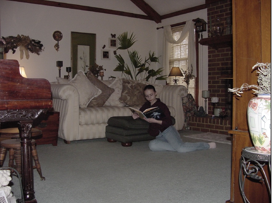
A long shot provides detail of a room.
The long shot provides lots of visual detail, but notice how small the subject appears. That’s the trade-off in these kinds of photographs. In general, it’s a good practice to keep your subject’s head about the size of a quarter. In this photograph, you should see the rule of thirds operating.
The subject is in the bottom, right-hand third of the shot. The subject could have been photographed deeper in the right-hand corner, but the cabinet on the right and the piano on the left provide a natural frame to force the viewer’s eye to the focal point. Note also that the subject is facing into the photograph, which is considered part of good composition that suggests balance.
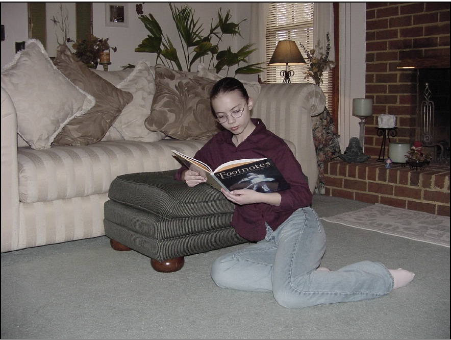
A medium shot is a closer shot of the subject.
In this photograph, Taylor’s entire body can be seen, but the appearance of the room is minimized. Now the editor must decide if she wants to include the room to give a sense of environment, or compromise and settle for some room and the entire subject.
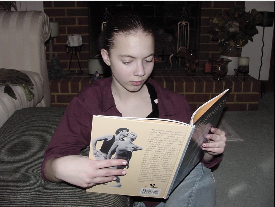
A close-up shot gives the picture a different feel.
In the long-range photograph and the medium-range photograph, the photographer dropped to one knee to shoot the subject’s face straight on. Most people shoot photographs from eye level. For a novel effect, consider getting very low or very high. Lie down and shoot a photograph from the worm’s eye view; then take the same photograph from the bird’s eye view. The results will surprise you, and, more importantly, your editor.
This photo may be too much of a close-up for the article that it accompanies; however, if you submit the long shot, medium shot and close-up shot, your editor will have a choice. This choice will provide a variety of layout and design solutions to play the article. The saturation approach can only improve the chances of your work getting published.
You now know the seven habits of highly effective photographers. These ideas can be summed up with the three C’s:
- Choose a strong focal point.
- Close in on your subject.
- Capture the moment.
Test yourself
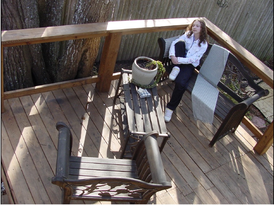
How many composition principles can you find?
For fun, examine the photograph to test yourself. How many of the seven principles of composition can you find in the photograph? The answer appears below. Answer: This photograph is a caricature of good composition.
- Move in. Getting close to your subject can enhance composition.
- Foreground and background. The foreground and background include some repetition, wood and lines either moving horizontally, vertically or diagonally.
- Lines. The shadow from the post and railing are lines that push the eye to the focal point, enhanced by the white in Taylor’s shoes and jacket.
- Z pattern. The furniture forms the Z pattern.
- Contrasts. Taylor wears a contrasting black and white outfit.
- Rule of thirds. She is located at the top right-hand corner of the photograph where two of the lines in the rule of thirds intersect.
- Repetition and patterns. The wood slats and boards are a repetitious element as is the pattern in the gingham fabric on the bench and table.
- Saturation. The photograph was taken from a high angle, a kind of long shot.
To practice these timeless principles of visual composition, take a walk and stop periodically and compose a photograph. Try the rule of thirds. Think about contrasts. Consider repetition, lines and shapes. In all these cases, you won’t find an ideal photograph, but you’ll come close. Look for the photograph that is there.
Really look and you will see it, although it won’t include all the composition principles.
It is like a game of golf. A hole-in-one is rare; however, the shot that is closest to the pin is considered excellent golf. As you take a photograph, concentrate on the ideal, but be ready to take a solid photograph that meets at least one of the composition principles. Over time you will find that your eye will improve, and then your photographs will improve, enhancing your sense of fulfillment and your paycheck.
Related posts
Magazine Training International’s mission is to encourage, strengthen, and provide training and resources to Christian magazine publishers as they seek to build the church and reach their societies for Christ.

