
While they’re great illustrators of data, graphs and charts can also be incredibly misleading.
Since the days of painting on cave walls, people have been representing information through figures and images. Nowadays, data visualization experts know that presenting information visually helps people better understand complicated data. The problem is that data visualizations can also leave you with the wrong idea – whether the images are sloppily made or intentionally misleading.
Take for example the bar graph presented at an April 6 press briefing by members of the White House Coronavirus Task Force. It’s titled “COVID-19 testing in the U.S.” and illustrates almost 2 million coronavirus tests completed up to that point. President Trump used the graph to support his assertion that testing was “going up at a rapid rate.” Based on this graphic many viewers likely took away the same conclusion – but it is incorrect.
The graph shows the total cumulative number of tests performed over months, not the number of new tests each day. 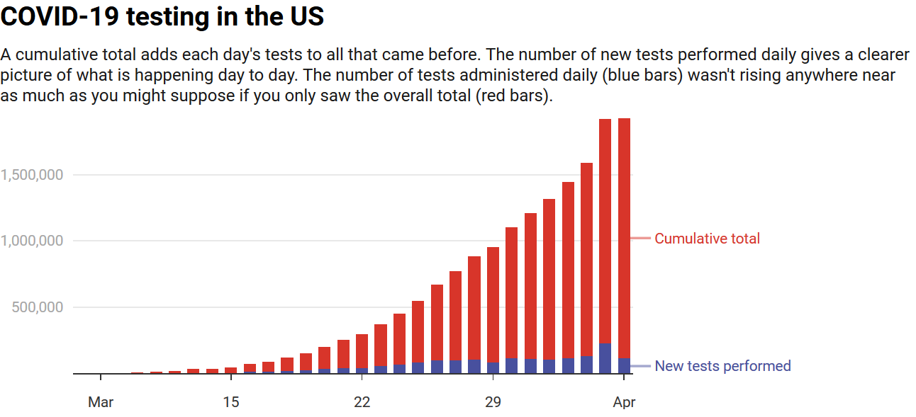
Chart: The Conversation, CC-BY-ND Source: Our World in Data
When you graph the number of new tests by date, you can see the number of COVID-19 tests performed between March and April did increase through time, but not rapidly. This instance is one of many when important information was not properly understood or well communicated.
As a researcher of hazard and risk communication, I think a lot about how people interpret the charts, graphs and maps they encounter daily.
Whether they show COVID-19 cases, global warming trends, high-risk tsunami zones, or utility usage, being able to correctly assess and interpret figures allows you to make informed decisions. Unfortunately, not all figures are created equal.
If you can spot a figure’s pitfalls you can avoid the bad ones. Consider the following three key questions the next time you see a graph, map or other data visual so you can confidently decide what to do with that new nugget of information.
What Is This Figure Trying To Tell Me?
Start by reading the title, looking at the labels and checking the caption. If these are not available – be very wary. Labels will be on the horizontal and vertical axes on graphs or in a legend on maps. People often overlook them, but this information is crucial for putting everything you see in the visualization into context.
Look at the units of measure – are they in days or years, Celsius or Fahrenheit, counts, age, or what? Are they evenly spaced along the axis? Many of the recent COVID-19 cumulative case graphs use a logarithmic scale, where the the intervals along the vertical axis are not equally spaced. This creates confusion for people unfamiliar with this format.
For instance, a graph from “The Rachel Maddow Show” on MSNBC, showed coronavirus cases in the United States between Jan. 21 and March 11. The x-axis units on the horizontal are time (in a month-day format) and the y-axis units on the vertical are presumably cumulative case counts, though it does not specify.
The main issue with this graph is that the time periods between consecutive dates are uneven.
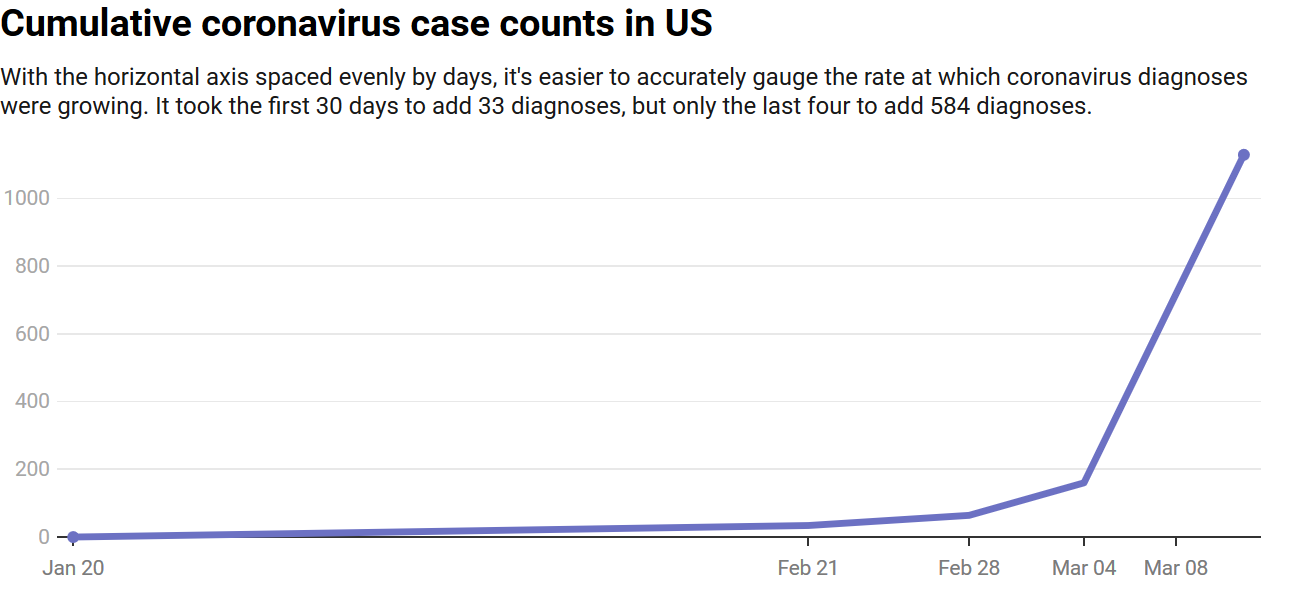
Chart: The Conversation, CC-BY-ND Source: MSNBC
By Carson MacPherson-Krutsky, The Conversation
Related posts
Category: Uncategorized
Malnutrition is a health crisis affecting millions around the world — and one becoming more urgent as the pandemic continues. Its impact is not just represented in [...]
Magazine Training International’s mission is to encourage, strengthen, and provide training and resources to Christian magazine publishers as they seek to build the church and reach their societies for Christ.