What is brand personality?
What is your brand personality? Hint: It’s not your personality. It’s not your team’s vibe. It’s not the look and feel of your product. It might not even be what you had in mind when starting your company.
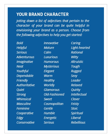
Start by describing your brand as if it were a person. Make a list of keywords that describe the personality and how your want your brand to be perceived by your target audience. How do you want to make your audience feel? Often a brand’s personality is similar to that of the target audience.
You can take a quiz to help determine your magazine’s brand personality. There are a lot of free quizzes. Here is one.
Before choosing a brand personality, do some research. You need to know who you are, what your product is, and who your target audience is. Then brainstorm options like what kind of voice relates best to them. Once you have the voice, a brand guide will help keep everyone on track and create a consistent brand personality throughout every aspect of your magazine.
The below graphic from this website describes the process of describing your brand personality, and can help you get started on this simple, fun and extremely powerful early branding exercise, which is best done together with your team.

Personality vs. Identity
As you think about brand personality, don’t get it confused with brand identity. Personality is the emotional and human, association to a brand. Identity is the image created and used by a company to relate to consumers. An identity can include all forms of communication and visuals such as logos, colors or fonts.
But the two work closely together. A brand’s identity should be part of its personality. A fun voice and personality mean nothing if the logo and images are all very formal. It is important to create both a voice and visuals that work together.
Once you determine your personality, it’s time to start designing around it. Create a set of visuals that show off that personality and style. The key visual elements are color, typography and imagery. Just as words create voice, so do the visuals. Certain colors can make you feel happy or sad, fonts can be seen as feminine or masculine, images can be dark and mysterious, or inviting and happy. Other elements can be seen as emotionless.
Here are a few common elements from this website and their associations:
Color
Warm color: Happy, inviting, stimulating, active
Cool color: Calm, relaxed, serene
No color: Stark, bleak, simple
Complementary color: Harmonious, soothing, trustworthy
Contrasting color: Bold, active, impactful, chaotic, energetic
Saturated: Intense, bold
Typography
Serif typefaces: Formal, trusting, mature
Sans serif typefaces: Informal, agreeable, modern
Script typefaces: Typically feminine, elaborate, special
Uppercase type: Impactful, bold, pushy
Lowercase type: Informal, relaxed
Titlecase type: Trustworthy, solid, expected
Images
Images with no borders: Informal, fun, surprising
Images with heavy borders: Strong, impactful
Images with fine borders: Expected, mature, honest
Other elements
Square elements: Formal, expected, mature
Rounded elements: Informal, fun, casual, modern
Alignment: Common alignments are more formal (left and justified), while right and centered alignments are more casual and chaotic
Space: More space creates a sense of organization and harmony while tightly packed elements seem cluttered and chaotic
Now that you have your brand personality figured out, go further with these 20 questions to consider when creating a brand identity.
Here are some additional tips on promoting your brand through ancillary products.
Related posts
Magazine Training International’s mission is to encourage, strengthen, and provide training and resources to Christian magazine publishers as they seek to build the church and reach their societies for Christ.

