The Johns Hopkins COVID-19 dashboard — with its clear numbers, and its red bubbles on a dark world map — has become the trusted picture of the pandemic for many reporters and audiences around the world.
And it represents the broader emergence of data visualization tools as one of the most powerful vehicles for public understanding of the invisible global threat.
But, according to the world-renowned visualization professor Alberto Cairo, even that excellent Johns Hopkins graphic could be improved.
That’s because the bubbles over Europe represent cases by country, while those over the United States represent counties — and some audiences, he said, might misunderstand the volume of bubbles over the US.
“This graphic is wonderful,” said Cairo, who holds the Knight Chair in Visual Journalism at the School of Communication of the University of Miami. “But should we make the level of this data more consistent? Perhaps at just the national level, and then we can zoom in to the county level?”
In the twelfth webinar in GIJN’s series on Investigating the Pandemic, investigative reporter Danielle Ivory and health data expert Amanda Makulec joined Cairo in sharing insights on how journalists should choose and present graphic forms, and the data behind them. They spoke in front of an online audience of 266 journalists from 46 countries.
The panel’s consensus was this: Having carefully verified the information, journalists should not only show the data in the most appropriate and digestible forms, but also clearly explain both the graphic and the data, and the uncertainty behind it.
Cairo said visualization has proved to be one of the most effective information delivery formats globally, helping the public’s understanding of the pandemic.
“I think that it’s clear that the most difficult part of covering the coronavirus crisis has had to do with the quality of the data, and not visualization,” said Cairo, whose latest book on the craft is titled How Charts Lie — Getting Smarter about Visual Information. “If there is a piece of good news, it is that visualization has been a winner, and is becoming more popular. But I have also observed many mistakes in how data about the pandemic has been visualized.”
Makulec, a health information expert and the operations director at the Data Visualization Society, warned that reporters need to understand how COVID-19 data is collected and aggregated before considering the information for use in graphics or charts.
For instance, she showed 10 separate steps — from the taking of swabs to inputs on testing site spreadsheets — at which human error or data lags could occur before COVID-19 case counts are reported in national datasets.
Ivory, an investigative reporter at The New York Times, said apples-to-apples data comparisons on COVID-19 cases represented a major challenge, with health officials across states and counties frequently citing different datasets, or using differing definitions. Some might cite confirmed cases or deaths, while others might cite probable cases — and then switch to the other approach, or revise their numbers.
Last month, Ivory and her colleagues revealed that more than a third of all COVID-19 deaths in the US were related to long-term care institutions, including nursing homes.
“We were able to collect data from almost every state, and we’re still collecting — it’s pretty much an around-the-clock effort,” said Ivory. “About 70% of it is collected manually, with calls or going to a state’s website, and much of the rest is collected via [automated] scraper, and hopefully more can be collected that way to make it a sustainable process. But we are very careful to be transparent about what we don’t know.”
Ivory said making phone calls directly to health officials remained the best way to sort out apparently-confused or contradictory data that flowed in.
Drawing from the three speakers, here are some tips for how to get the visualization of COVID-19 data right.
Top 10 tips
(1) Explain how to read the graphic, before you explain how to read the data. In a recent graphic on jobs lost due to the pandemic, The New York Times included prominent explainers, using simple language like this: “Each bubble on this chart represents an occupation. The bigger the bubble, the more people do that job.”
(2) Write the text of your graphic at the same time that you are designing your graphic, as this process helps to frame the process for both you and the reader.
(3) Sort the data in an intuitive way — such as chronologically, or in comparable groups.

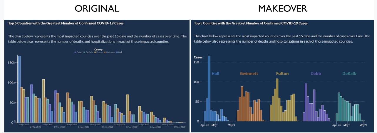
Cairo reorganized COVID-19 data from a confusing bar graph from the Georgia Department of Health (left) into a new chart (right) grouped by county, and arranged chronologically.
(4) If you or your audience are new to data visualizations, start simple, with basic graphics like maps, bar graphs, or line charts. Consider tools like Datawrapper, Flourish, and iNZight. Follow expert online tutorials on free tools, like Cairo’s guide.
(5) Don’t limit yourself to simple tools and charts. Challenge your audience occasionally with incremental changes in how you present data visually.

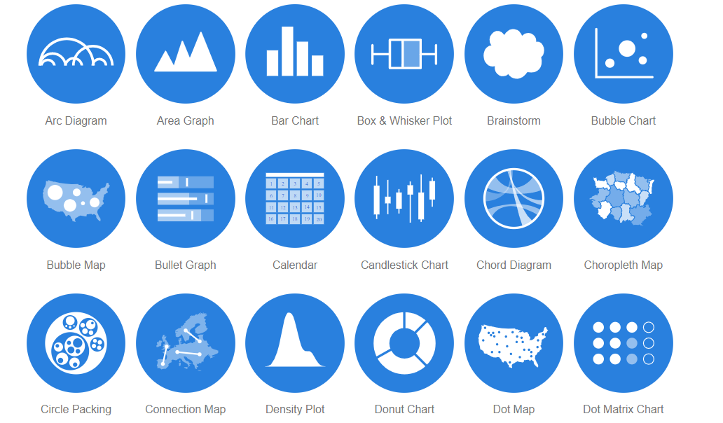
Some of the many data visualization forms that editors can choose. Image credit: datavizcatalogue.com
(6) Don’t try to visualize too much data, and edit it down if it seems over-presented. Define the key points and stick to those.
(7) There are no bad visualization formats, but some are more appropriate for the dataset and the audience than others. Charts that seem especially counter-intuitive may need a secondary chart as a reference point. For instance, cartograms — which distort areas on a map, depending on their relative share of a variable — should be presented with an ordinary map of that area alongside for comparison.
by Rowan Philp, International Journalists’ Network
Related posts
Magazine Training International’s mission is to encourage, strengthen, and provide training and resources to Christian magazine publishers as they seek to build the church and reach their societies for Christ.

