By: Klaris Chua
It’s becoming hard to ignore the fact that websites present small businesses with enormous benefits.
As people become more connected to the digital world, the brick and mortar store isn’t the only option anymore. Creating a website is more effective and trackable in terms of opportunities and results.
In a 2017 survey, 92% of small businesses said that they will have a website ready by 2018.
Luckily, creating a website has never been easier. Even if you don’t have coding or design skills, there are many services, tools, and guides available at your disposal. There’s really no excuse not to have one.
Unfortunately, it can still be intimidating. Many small business owners don’t have tech backgrounds, and there are a lot of mistakes to make.
This article will dive into key components that small business owners sometimes overlook when creating their websites and focus on the four areas you need to get right.
Shopping Cart
Selling goods without having a proper ecommerce component is like cooking a cheesecake on a stovetop: it might get the job done, but it wouldn’t be nearly as delicious as something baked in an oven.
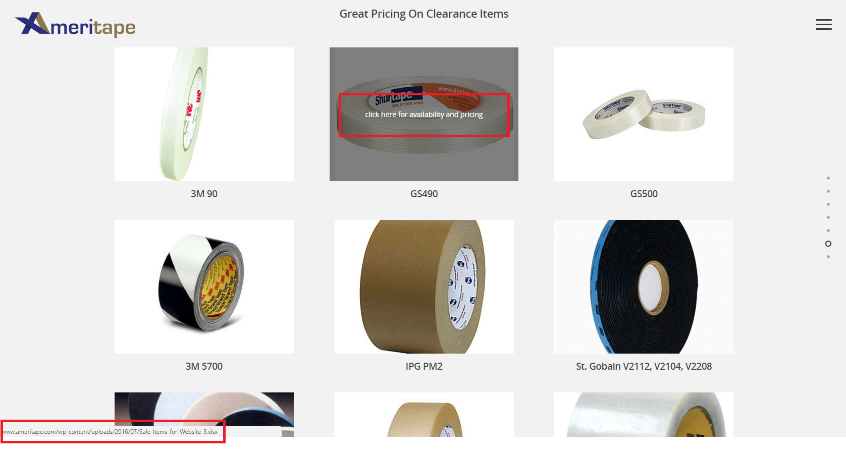
Take, for instance, this website for adhesive products…

The site looks pretty easy on the eyes. It even has the trendy parallax scrolling effect and an HTML5 video background to boot. But when you go further down the site to view their catalog, you’ll see that the only option you’d get is to either download the pricing in a spreadsheet format or view photos and descriptions of specific offerings.
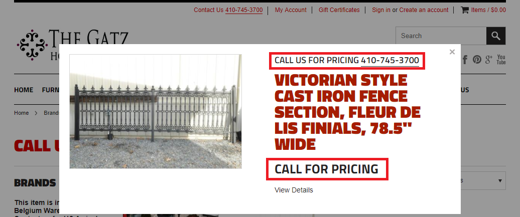
Instead, why not showcase all your products and product numbers, but add “call us for pricing” CTA’s on the title or description of an item?

There are also websites where there will be no CTA buttons at all on product pages.
You’d still buy these items anyway if you like them or need them enough. But you would probably think twice about it, and the conversion rate would be seriously low. Manual ordering can be too tasking and inconvenient for some consumers in these modern times.
If you own a business and you’re trying to sell your items online, you’d want to give the customer the full experience; you’d want to give them options even if they don’t intend to purchase right away.
If you don’t know how to navigate the product page component of your site yet, you can easily turn to the tried-and-tested ecommerce services and take note of the best practices mentioned in Wishpond’s “How to Get More Sales from your Ecommerce Product Page.”
Contact Info
Maybe you offer just two or three items; or maybe you’re selling a service instead of tangible products.
In these cases, putting up a shopping cart may not be appropriate. In this case, it’s important for your customers to be able to reach you instantly.
Make your business number prominent on your website, or create a contact form that’s suitable for your target audience.
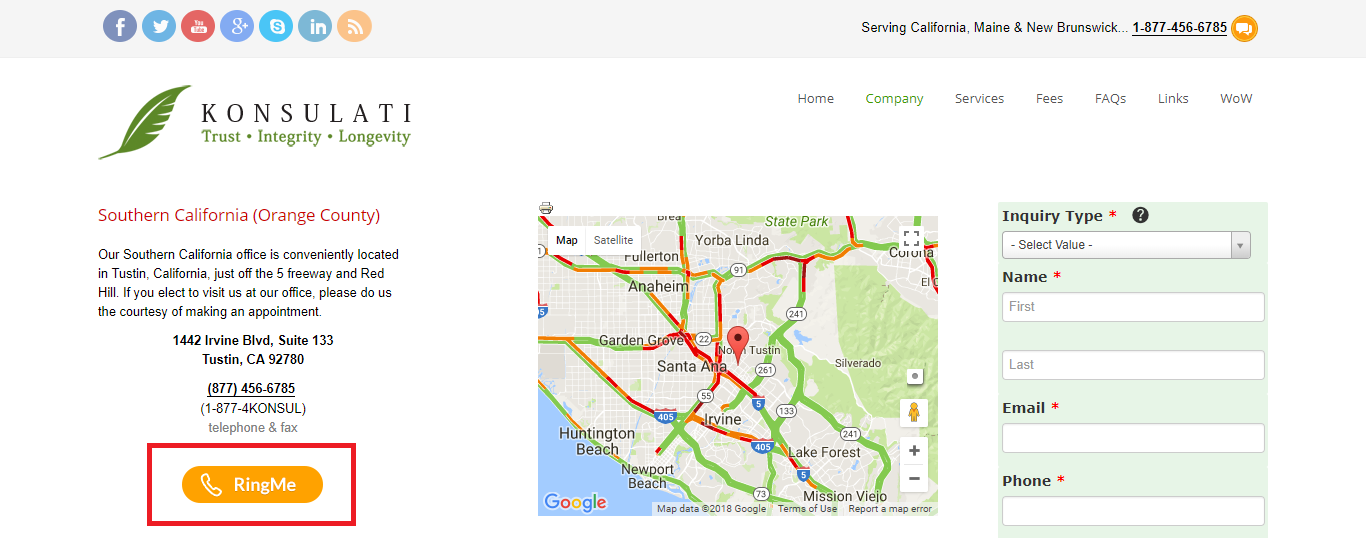
Some small business owners would even go as far as adding a click-to-call button that will prompt customers for their numbers, connect them to a phone service, and make the phone service ring their number.
Here are a couple examples:


When you click on the buttons, you’ll be able to call the company’s number but won’t be charged for the call because it will be shouldered by the called party. Think of it as if you’re placing a toll-free call, but instead of a desk phone, you’re using your browser.
About Page
Often, the creation of your website’s About Page is an after-thought – thrown together from the website’s theme with few changes.
On the internet, establishing trust is the name of the game.
To truly make a good and lasting impression among potential customers, you need to make sure that you can convey your values and passions through this page right away.

Charm your way into your audience’s hearts by highlighting how you started, or by defining what problems do you want solved. Answer questions like, “What makes my brand stand out?” or “What’s in it for them?” Give your customers the confidence that you are a real person, and that you continuously strive to provide them with only the best products or services.

About pages can trigger emotions that can inspire website visitors to support your small business. Don’t succumb to the practice of filling it with jargon commonly seen on some sites – like the one you see above – that although sounds smart, sounds somewhat impersonal.
Mobile-Friendliness
Moz has noticed how Google is dedicating a lot of its efforts towards “evangelizing and forcing a change of mindset from desktop to mobile.” If you’re a business owner, you should expect that visitors will be using different devices to visit your site.
Therefore, it’s crucial to make sure that your website is designed to be accessible on any screen size. Don’t be part of the alarming statistic that says only 30% of small business websites are mobile-friendly.
Related posts
Magazine Training International’s mission is to encourage, strengthen, and provide training and resources to Christian magazine publishers as they seek to build the church and reach their societies for Christ.

