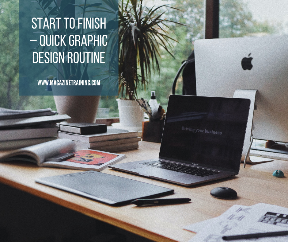
It’s 4:30pm, the office closes at 5, and you need a graphic for your Facebook post that should have been done yesterday. Take a deep breath, stretch, and follow these five steps to have a quick graphic design in 30 minutes that looks like you spent hours. While this simple process is by no means an adequate replacement for a good designer, you can use these resources and routine when you need a nice-looking graphic done fast.
Step 1: Gather content.
What do you want your graphic to accomplish? Will it need bold colors to grab attention, or a rustic earth-tone to captivate warmth? Is it educational or emotional? Will it be text-heavy or photo-based? Come up with a rough idea now to streamline the creation process.
Step 2: Create your space.
Now is the time to decide where to use this image. Every social media site has a set size that will work best for any image post. For Facebook, images should be 940×788 pixels, while the best size for Twitter is 1024×512 pixels.
Once you decide where you’ll use the image, go ahead and create a blank document for it in Photoshop or another image editor. A great free image editor is Canva.com. Even though we have Photoshop at MTI, we often check Canva to get the perfect image size, or explore their pre-made layouts for design inspiration.
[bctt tweet=”5 steps to build a quality graphic in less than 20 minutes.”]Step 3: Snag an image.
Check our post Top 10 free photos sites for some great sites with free high-quality photos. When searching for an image, keep your design-concept in mind. If your graphic will have lots of text, look for simple images with enough space so the text can be easily read. Also keep the layout of your image in mind. If your design is square or rectangular, look for a photo that will still look good when it’s resized.
Go ahead a plop your image onto your design space. Move and adjust your image as needed. Next, type in your text using the default font and go to Step 4.
Step 4: Recruit the perfect fonts.
Whether they can admit it or not, everyone loves a good font pairing. When typography is used correctly, it can drastically enhance your graphic and clarify the mood. Try to mix a serif font with a sans-serif font. And even though you probably have an awesome collection of cool fonts to use, discipline yourself to use no more than three different fonts on one image.
Also, choose only fonts that keep the message readable. If you found the coolest font in the universe, but it’s impossible to read, what’s the point of saying anything at all? Even if it’s only slightly difficult to read, you must remember that most social media users will only pause for three seconds before they move on to the next post.
Fontsquirrel.com is a great source for free high-quality fonts to build up your font library. If you need a boost to find a nice pair, check Typ.io for typography inspiration. After you have your font or font pair, apply the font to your text and resize and color as needed.
Step 5: Add design elements.
If you’re not a graphic designer, trick yourself into thinking like one. Consider elements you can add (or remove) that would create visual interest–think dots, lines, splatters, erased edges, shapes, boxes, transparency, color tone…
Save your image and your done! You’ve created a graphic for your post–and you get to leave the office on time!
Do you have a design resource you love? Share with us in the comments below.
Related posts
Magazine Training International’s mission is to encourage, strengthen, and provide training and resources to Christian magazine publishers as they seek to build the church and reach their societies for Christ.

